
Shopping cart abandonment continues to be a major pain point for ecommerce store owners.
According to Baymard Institute, the average online cart abandonment rate is 69.99%, which translates to 7 out of 10 shoppers not completing their purchase.
That’s an alarming statistic, but it’s even more worrisome when you realize that the abandonment rate for mobile users is even higher, at 85.65%.
Not everyone who visits your store will buy, but you can reduce the cart abandonment rate by making your checkout process as seamless as possible (although the ecommerce platform you use can impact how easy this is).
We have put together these six checkout page examples, highlighting their good and bad points.
Next, we’ll discuss how you can improve your customers’ checkout experience and ultimately increase your revenue and conversion rate.
Checkout Page Examples And How To Improve Them
1. Dermalogica
Dermalogica is a professional-grade skincare brand that runs on the Shopify platform. The brand caters to skin therapists and consumers.
Dermalogica does a lot of things to ensure a seamless checkout process.
For instance, it has an express checkout option, which is excellent if you’re in a rush for time or don’t want to spend time filling out form fields in the regular checkout flow.
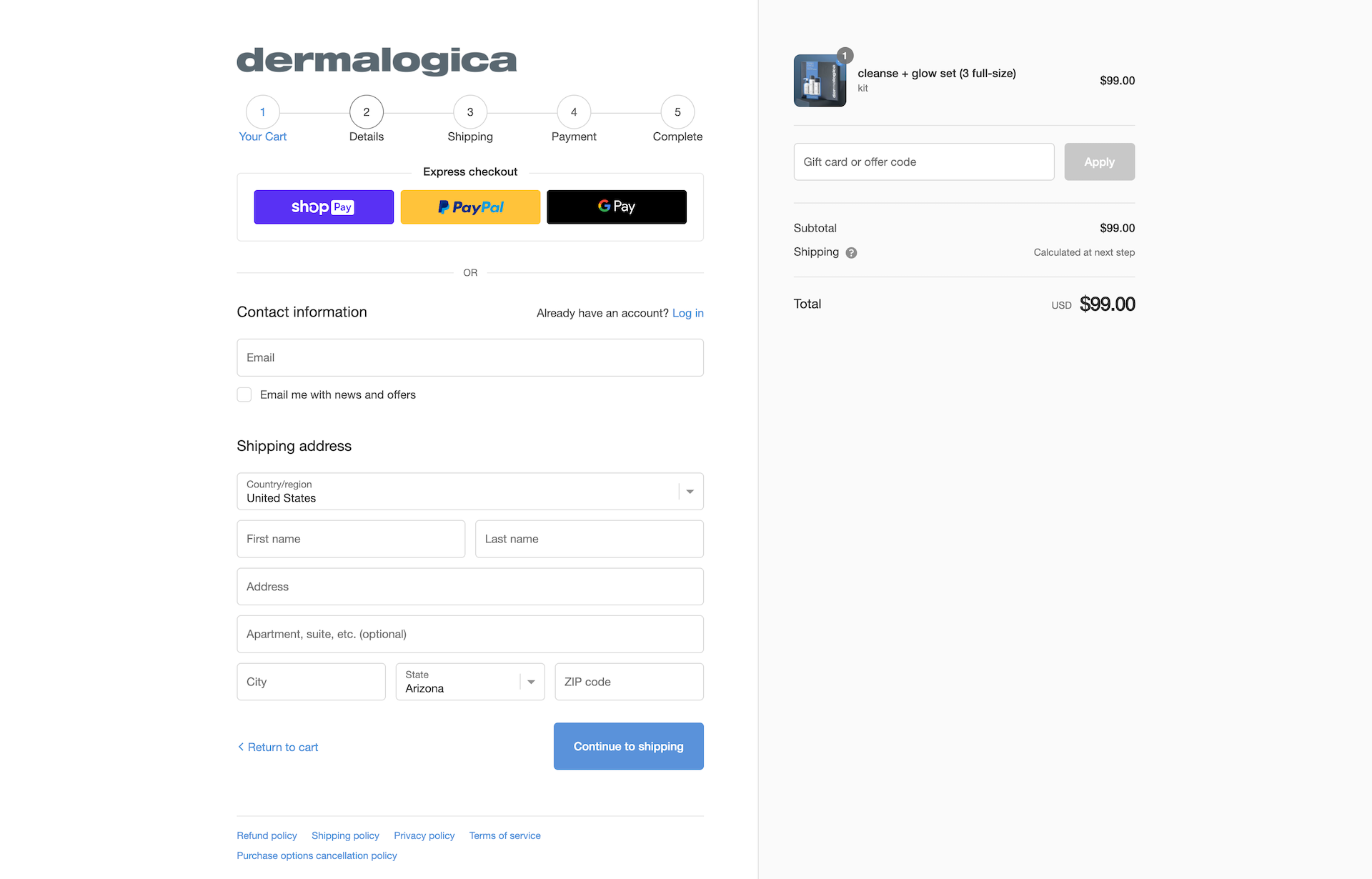
Pros
- Express checkout: It speeds up the purchasing process and enables customers to check out faster.
- A progress bar: Customers can see exactly how far they are from finishing the purchase and how many steps they have left to complete it.
- Different payment options: Shoppers can choose from the popular payment methods supported in their region, including credit cards.
Cons
- No trust badges or security seals: Shoppers want to ensure their personal information is secure and protected at all times, so a lack of security badges may be off-putting for some buyers.
- There are too many form fields: 17% of US online shoppers have abandoned a cart because the checkout process was too long or complicated. Given this, it may be a good idea to reduce the number of required form fields on your checkout pages.
2. Bellroy
The checkout pages that enhance the shopper’s experience are simple and clean, and Bellroy exemplifies that.
It adopts a one-page checkout style, structured into steps guiding the user. It reveals all the relevant information upfront, so there are no surprises at the end.
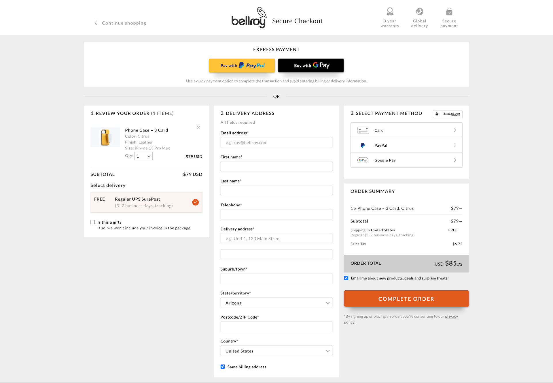 Screenshot from bellroy.com, November 2022
Pros
- Form validation and error notification: With this feature, users can fill out each field correctly and avoid submitting the form with incorrect information.
- Guest checkout: First-time customers don’t have to create an account to complete the purchase. As a result, their checkout experience will be smooth and hassle-free.
- One-page checkout: It’s efficient because users don’t have to jump from page to page to complete the entire purchase process. This convenience encourages more purchases.
Con
- No exit intent pop-up: Exit intent pop-ups help you convert visitors into customers by reminding them of products left in the cart as they’re about to leave your site.
3. B&H Photo Video Pro Audio
B&H Photo Video Pro Audio, running on the Drupal CMS platform, does many things on its checkout page well. It has a clean UI with minimal distractions.
A pop-up window appears after shoppers add an item to their cart with details and the recommended accessories.
Shoppers can also easily edit and remove items from their cart without leaving the checkout page.
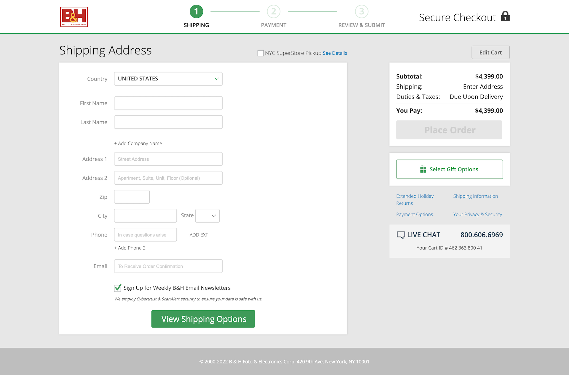 Screenshot from bhphotovideo.com, November 2022
Pros
- Clean UI with minimal distraction: It’s a no-frills design that keeps the focus squarely on the product details and the shopping cart.
- Express checkout: It reduces the friction in the purchasing process and improves the overall user experience for mobile users as well.
- Guest checkout: It’s convenient and allows first-time users to skip registration for the purchase.
- Secure Checkout text at the header of the page: This reassures shoppers that their information is secure and safe during payment transactions.
- A progress bar: With this feature, customers can see how much is left before completing the order, so they know how much longer they need to wait before they can check out successfully.
- Easy access to resources: Shoppers can find links to the shopping and return policies. They can also quickly chat live with customer care and sales support representatives if they need any assistance during the purchase process.
Con
- Too many form elements: On mobile, the forms get a bit overwhelming because there are too many fields to fill out, which makes the transaction process slower and more cumbersome for mobile users.
4. FLO Living
On the subject of keeping things simple, FLO Living, a health brand that sells natural supplements to women, does a stellar job with its single-page checkout design, built on the WooCommerce platform.
Drop-down menus and autofill boxes simplify the checkout process for customers, while the brand color is maintained on the site’s checkout page.
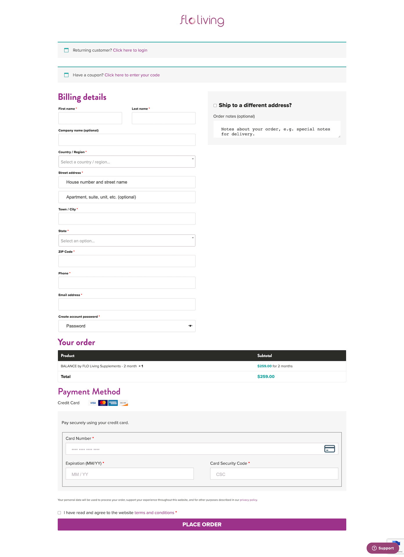 Screenshot from floliving.com, November 2022
Pros
- Simple design without sacrificing a brand element: The clean and minimalist design lets the product shine and keeps the focus on the product rather than the design itself.
- Autofill boxes: Customers can fill out their address and other details faster by populating data from their saved addresses.
- Guest checkout: It ensures shoppers don’t have to drop their details if they want to – especially if they are one-time buyers.
Cons
- Limited payment options: FLO allows only credit and debit cards, which can be a turn-off for customers who want to use alternative payment methods.
- Lengthy form: The long form can put off some users who want to finish their purchases as quickly as possible.
- No security badges: There is no visual indication of the website’s security badges or certifications to reassure customers that their personal information is safe and secure.
5. Nike
It’s no surprise that Nike nails its checkout page.
Again, the brand uses the Shopify platform for this. And its accordion-style checkout page guides users to complete the payment without distractions.
There are no hidden costs to discourage customers from checking out, and the order summary is easily accessible throughout checkout.
 Screenshot from nike.com, November 2022
Pros
- One-page checkout style: There is no need to switch between pages to complete orders.
- No hidden fees: The price listed on the product page is what customers will pay at checkout, which helps avoid customer confusion and dissatisfaction due to unexpected costs at checkout.
- Guest checkout: Even first-time shoppers don’t have to register an account to check out and pay for their orders, which speeds up the process and increases conversions.
- Delivery options: Customers can choose their preferred delivery option during checkout based on their location and time constraints, which improves the shopping experience.
- Live chat button: Live chat support is available at all times, providing quick answers to queries that potential customers may have.
- No lengthy form fields: The form fields are limited to the necessary information needed to complete an order, so customers can complete payment in just a few minutes.
Cons
- No trust badges: There are no logos or certificates from third-party services to help increase customer confidence about the security of their personal and payment information. You could make a case that the brand’s stature is enough, but trust badges are among the best practices for checkout pages.
- No exit intent pop-up: There is no exit intent pop-up on the checkout page to persuade shoppers to complete their purchase and prevent cart abandonment.
6. Etsy
The Etsy platform ticks many boxes.
Its checkout page area is clean, with easy-to-use navigation and a progress bar to visually show how far along the order is in the process.
The form elements are not overly long, and it also offers a guest checkout.
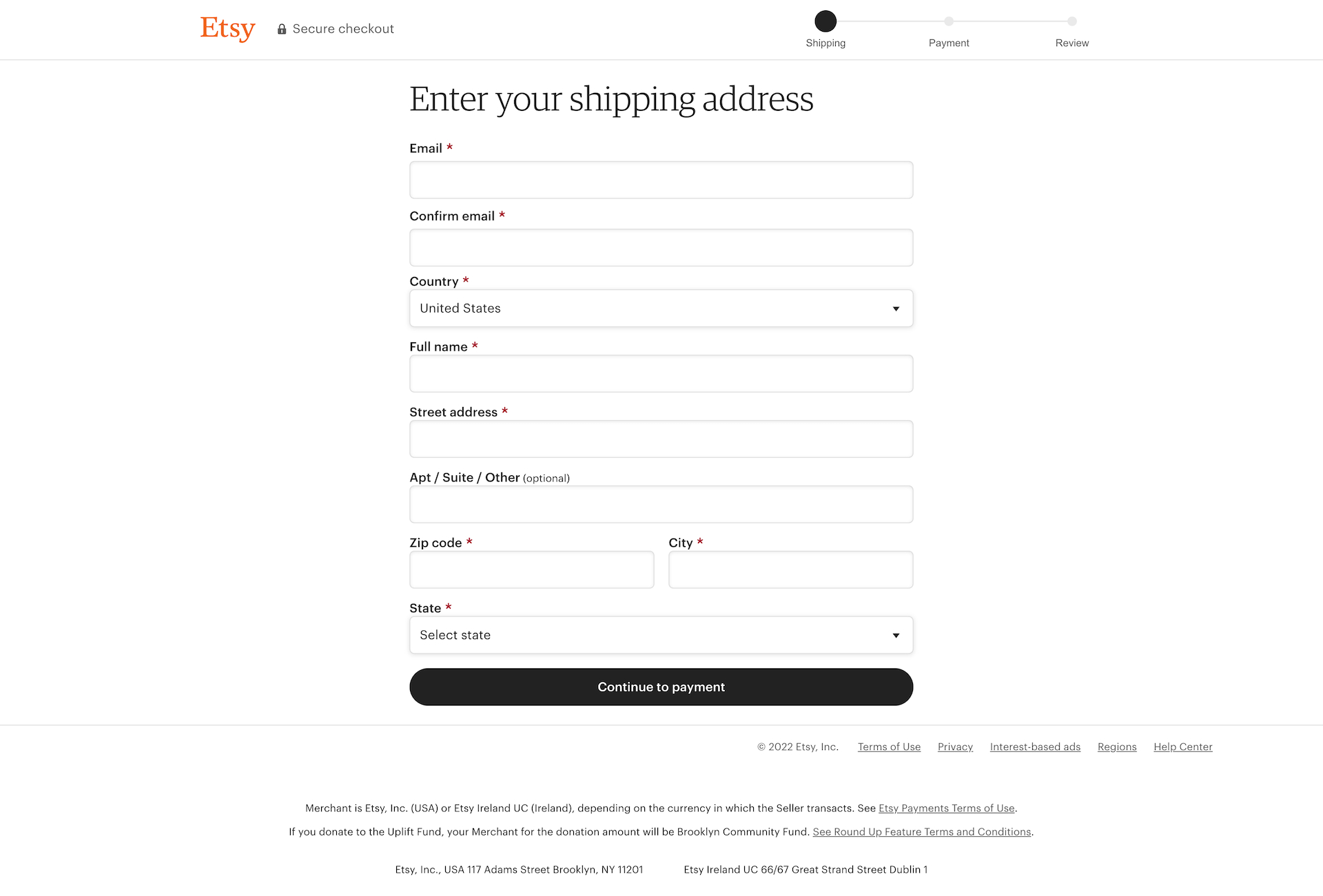 Screenshot from etsy.com, November 2022
Pros
- A progress bar: Shoppers can see how far along they are in the checkout process with a progress bar located at the top of the checkout page.
- No hidden costs: Customers know exactly what they will be paying throughout the order completion process, so there are no surprises at checkout.
- Form validation and error notification: As users complete the form elements, the validation checks ensure they enter the correct information before progressing further with the order.
- Guest checkout: Users don’t need to register an account to complete the purchase, which speeds up the checkout process and increases conversions.
Cons
- No exit intent pop-up: There is no exit intent pop-up on the checkout page to persuade shoppers to complete purchases quickly and prevent cart abandonment.
- No security badges: There are no logos or certificates from third-party services to help increase customer confidence about their secure personal and payment information.
- No express checkout: Unlike some of the other websites here, there is no express checkout option to speed up the process (this may be a limitation caused by inherent differences between the Shopify and Etsy platforms). For example, Shopify stores let you add Shop Pay as an express checkout option, with store payment details across all Shopify stores.
Quick Checklist For Your Ecommerce Checkout Page
Ecommerce websites have different needs, but there are certain elements on an ideal checkout page that every store should consider:
Allow Guest Checkout
Many businesses make the mistake of asking customers to create an account before they purchase a product.
But many buyers only intend to buy a product once, so it makes no sense for them to leave their details when they may not return.
This hassle prevents customers from making a purchase altogether, especially if they have to do things like verify their email.
With a guest checkout option, these customers can purchase without creating an account, which is a much better choice for both of you.
Add Trust Seals
With increasing cybercrime, customers prefer to shop from stores they can trust.
A trust seal or related trust signals on the checkout page can help boost your store’s credibility and encourage customers to complete the purchase process.
We don’t recommend displaying seals on every page, as customers will perceive this as spam.
But you should at least display one on your checkout page to show customers you take security seriously.
Avoid Unexpected Costs
When creating your checkout workflow, make sure the order summary is complete, so customers have a good understanding of what they are purchasing.
Then, don’t add additional costs at checkout that can increase cart abandonment.
Provide Good Customer Support
Regardless of the industry, customers prefer to purchase from online brands that can provide excellent customer support.
You can improve your chances of gaining customer loyalty by showing your support options upfront on your checkout page. For example, you can instantly integrate live chat software or include a live chat button that leads to customer support.
These simple improvements go a long way in meeting customer needs and increasing conversion rates.
Add A Progress Bar
Having a progress bar on your checkout page can motivate shoppers to complete their purchases quickly, which ultimately leads to higher conversions.
Enable Multiple Payment Options
Customers prefer to complete purchases via the payment methods of their choice.
So ensure you have a payment gateway that can take credit card payments, among other popular payment methods.
Boost Your Page Speed
Make it easy for customers to make a purchase from your ecommerce store.
A page that loads slowly or doesn’t load at all can cause customers to abandon the buying process.
But there are ways that you can make your website more search engine-friendly and load faster.
For example, you can use image compression tools and combine CSS and JS files to improve the load time of your website pages.
Conclusion
It only makes sense to make the checkout process as simple as possible and ensure your customers leave happy, with your products in their shopping baskets.
Don’t let these checkout examples be the only source of inspiration when it comes to optimizing your checkout page.
Follow the tips in this article to design an effective and secure shopping cart or checkout page for your online store.
More resources:
Featured Images: tmn art/Shutterstock
Con información de Search Engine Journal.
Leer la nota Completa > 6 Checkout Page Examples And How To Optimize Them


